Learn · Design
Slide design principles: hierarchy, density, and motion that teach
Slide design principles are decision rules for attention—not a taste contest. Hierarchy tells the eye what matters. Density controls how much the room can absorb. Motion should explain change, not celebrate the tool. If a slide is pretty but the claim is invisible, it failed design.
Hub: presentation design. Maker: AI presentation maker. Method: Method.
Deep dives: one idea per slide, visual hierarchy, before/after makeovers.
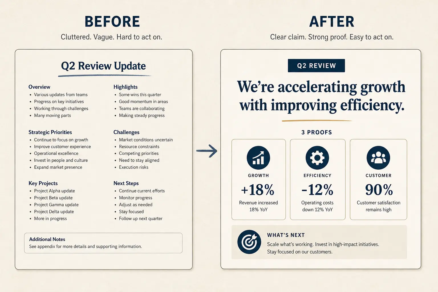
Hierarchy before decoration
Readers see title weight, then primary claim, then proof, then chrome. If five elements scream at equal volume, nothing is heard. Set one dominant element per slide. Use size, weight, and contrast—not more colors—to create order. Brand kits that force equal-weight icon grids are a constraint to manage, not an excuse for flat hierarchy.
Anatomy of a claim slide
Claim headline (one idea)
Supporting line that states the so-what for this audience.
Source / footnote
Density as a budget
Live rooms absorb less than async readers. Budget words and objects. If you need twenty bullets, you need more slides or a leave-behind. Density errors feel like design problems but are usually structure problems—see one idea per slide.
Slide density spectrum
Sparse
Live stage
1 claim, huge type
Balanced
Default
Claim + 3 proofs
Dense
Leave-behind
Detail for async read
Interactive: rewrite weak bullets
Paste a cluttered slide. Force claim, proof, ask structure before you restyle.
Weak bullets → claim/proof/ask
Paste a bad slide. Get a rewrite pattern you can drop into Gamma, not vibes, a structure.
- Claim: Overview (make the cost of inaction obvious)
- Proof: Key features (add a number, name, or constraint)
- Proof: Benefits (add a number, name, or constraint)
- Proof: Differentiated platform (add a number, name, or constraint)
- Ask: Next steps (one decision, one owner, one date)
Color, type, and alignment
One family, clear size scale, consistent margins. Accent color for emphasis and links—not for every icon. Align edges. Uneven gaps read as unfinished even when content is strong. AI tools often randomize spacing; fix alignment in a dedicated pass after structure is locked.
Motion that teaches
Use motion to reveal steps in a process, to show before/after state, or to highlight a changing metric. Do not bounce logos. If the slide works as a static image, motion is optional; if understanding requires sequence, motion can earn its place.
Weak slide → strong slide
Before
- • Overview
- • Features
- • Next steps???
After
- • Cost of status quo
- • Wedge in one claim
- • Proof + decision ask
Worked example: three-pass fix
Starting slide: twelve bullets, five icons, three accent colors, title Overview. Pass one structure: retitle to Ticket backlog costs about forty hours per week. Pass two hierarchy: one metric dominant, three capability lines, mutual plan implication. Pass three density: move six bullets to appendix. Time spent: twenty-five minutes. Result: room can read the claim from the back row.
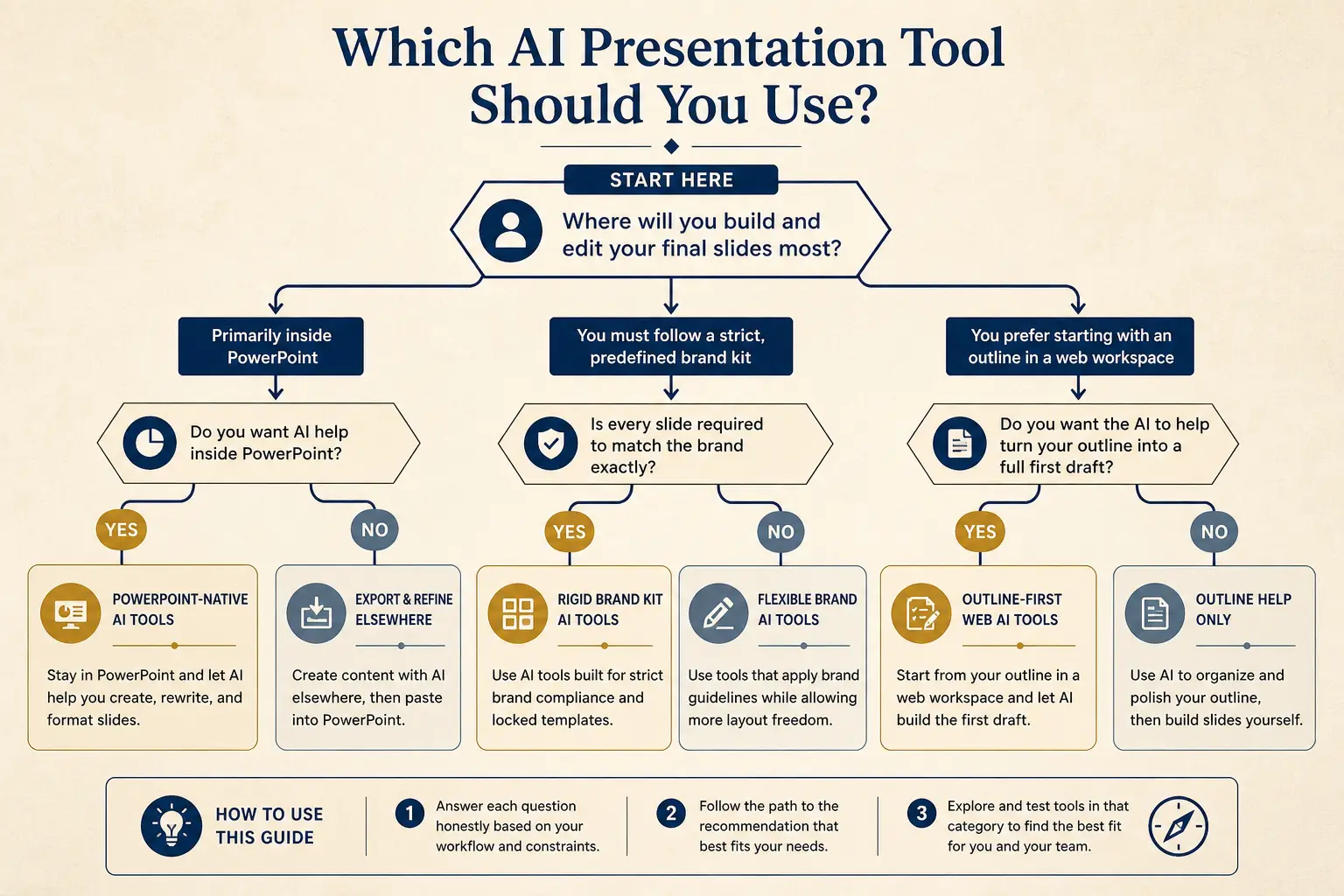
Which tool for which job
Need native PowerPoint editing every day?
Yes → Plus AI / Copilot · No → continue
Need rigid brand kits across a large team?
Yes → Beautiful.ai / enterprise kits · No → continue
Need outline-first AI drafting + present link?
Yes → Gamma
Failure modes
- Equal-weight clutter, Fix: one dominant element.
- Decoration first, Fix: structure pass first.
- Brochure live, Fix: density cut for channel.
- Accent rainbow, Fix: one accent.
- Motion noise, Fix: teach or remove.
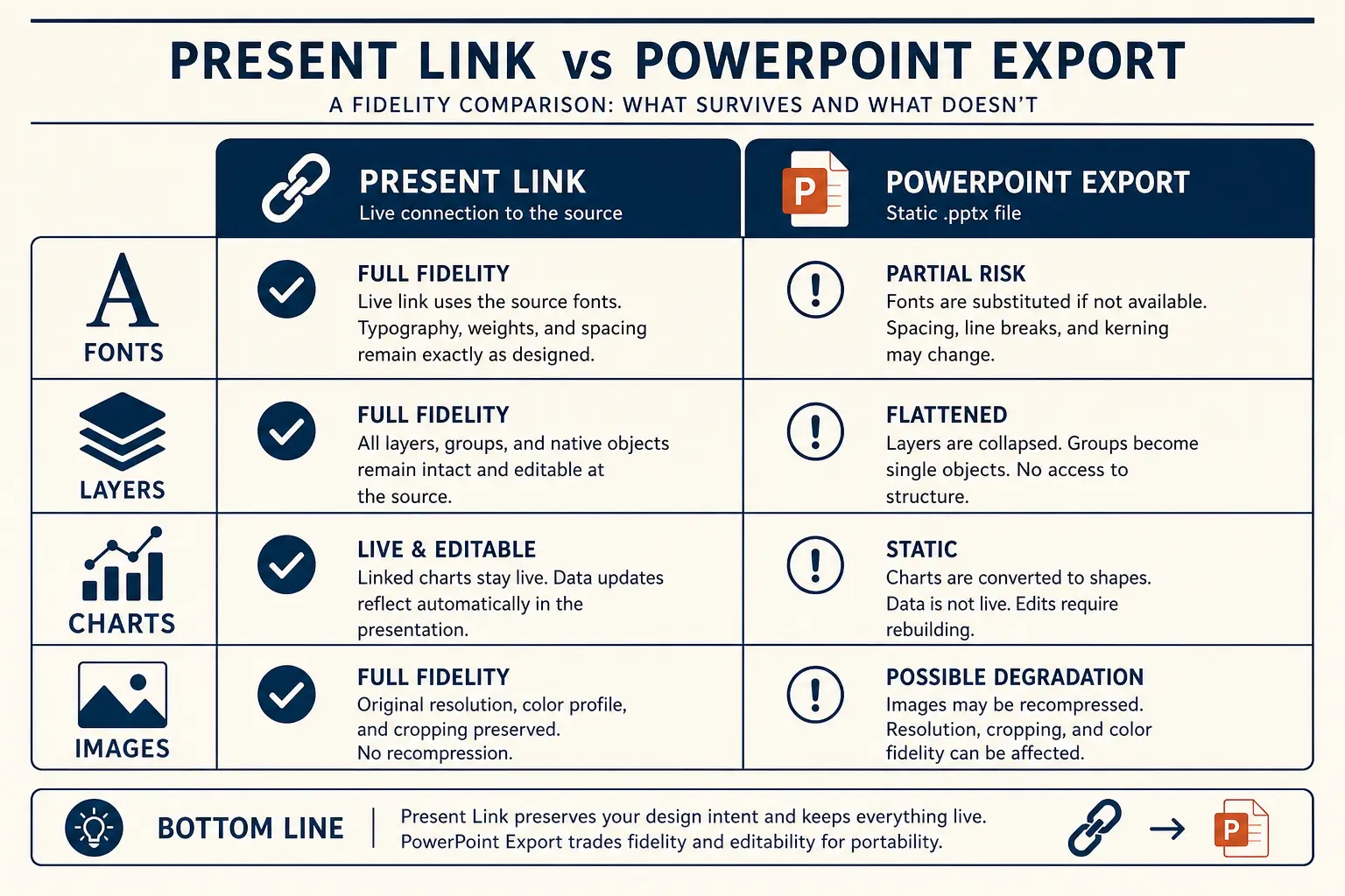
Present link vs PPTX fidelity
Present link
- • Live latest edits
- • Best for your room
- • Analytics-friendly
Export PPTX / PDF
- • Offline / procurement
- • Brand review in PPT
- • Expect cleanup passes
Not for you if…
If you need pixel-perfect brand systems across hundreds of templates, a rigid kit tool may fit better. If the story is wrong, design principles will not rescue it—return to outline-first structure.
Gamma next step
Lock outline and titles in AI presentation maker. Run BeforeAfterRewrite on the worst slide. Apply hierarchy and density, then stop—do not chase novelty layouts.
Time-to-usable-deck
Blank PPT path
Outline in docs → design fight → rebuild → 3–8 hours
Outline-first AI path
Prompt → edit outline → generate → polish → minutes to first usable draft
Evaluation rubric axes
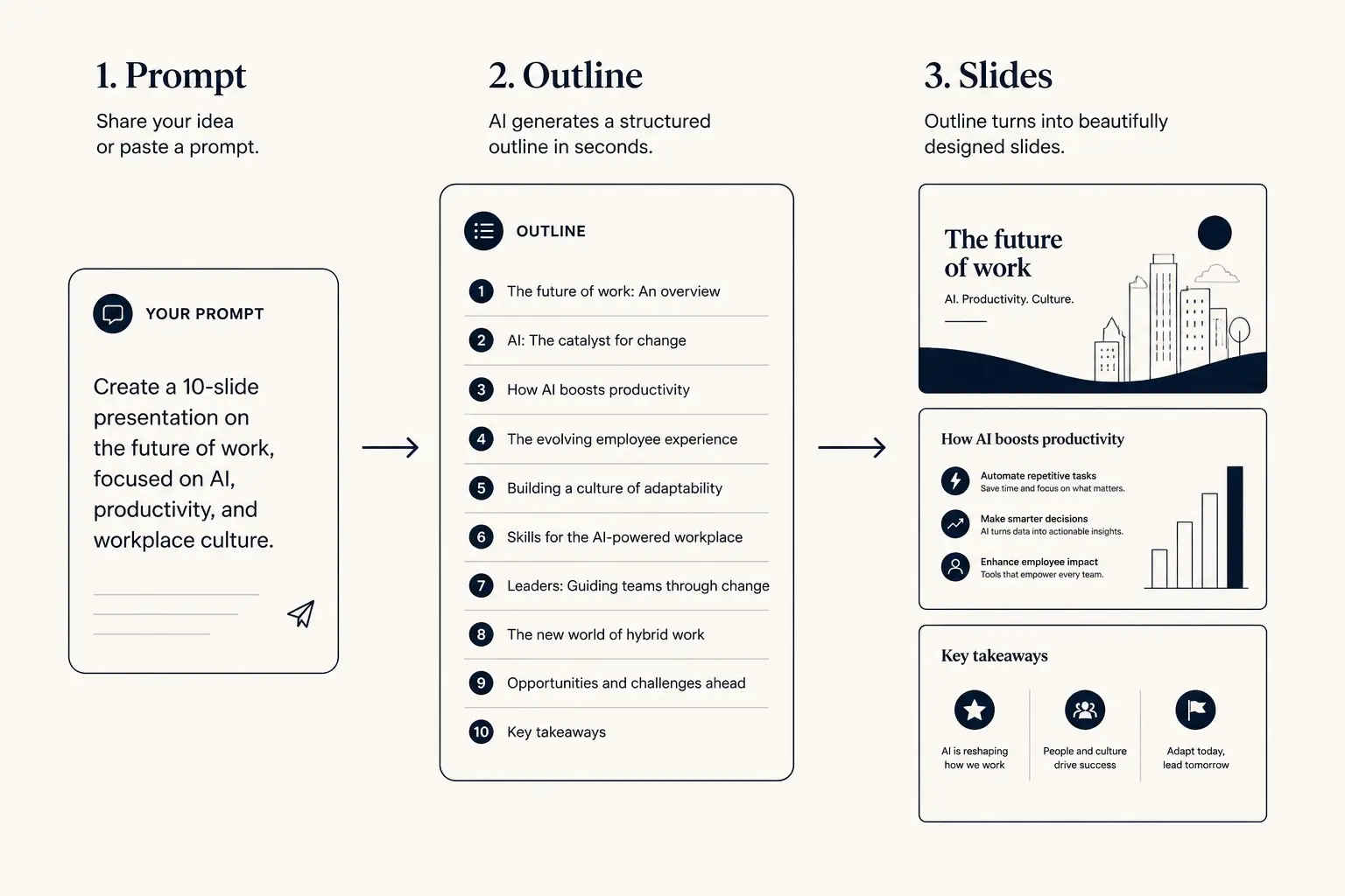
Prompt → outline → slides
1. Prompt
Audience, goal, length, proof you already have.
2. Outline
- • Opening claim
- • Proof beats
- • Ask / next step
3. Slides
Operating system: controls that keep AI drafts honest
Slide design principles fail when teams chase decoration before hierarchy. Write the decision the meeting must produce before you open the generator. Assign an owner for every assumption on the slide. Schedule a title-only review with someone who was not in the source meeting. When those three controls exist, AI drafts accelerate the spine instead of decorating a vague brochure. When they do not, you get polished ambiguity that stalls in the room. Keep a one-page failure log of decks that missed their job—wrong density, missing cost or decision framing, soft close, unlabeled options, invented metrics—and coach the pattern, not the personality of the author.
Checklist before send for Slide design principles: hierarchy, density, and motion that teach: every headline uses audience language; every proof artifact has a commitment label; every number has a source; the last slide names owner and date when a decision is required; live and leave-behind twins share a version when both exist; and you can delete twenty percent of slides without losing the decision path. In Gamma, paste constraints first—audience, minutes, stakes, proof you already have, and the ask—then reject outline sections that invent facts.
Express path for late joiners
Not every stakeholder needs the full tour of Slide design principles: hierarchy, density, and motion that teach. Build a three-slide express path: the cost of inaction or the core tension, the wedge with one proof point, and the dated ask or decision. If the main deck cannot compress into that express path, the narrative is still a catalog. Train managers to request the express path in reviews; it surfaces structural rot faster than debating color palettes. Pair this with the public evaluation axes on Method when you compare tools.
Micro-example: what good looks like in numbers
Concrete numbers beat adjectives for Slide design principles: hierarchy, density, and motion that teach. A thirty-five minute medium-stakes meeting usually supports eight to ten live narrative slides at roughly fifty seconds each, plus appendix. A sixty-minute high-stakes committee can support twelve to fourteen live slides if proof and risk earn the minutes. If your draft lands at twenty-two live slides for a thirty-minute call, you do not have a design problem—you have a prioritization problem. Cut until the title-only story still stands, then densify the async twin for readers who were not in the room.
Enablement: how managers review this deck type
Managers reviewing work about Slide design principles: hierarchy, density, and motion that teach should score binaries before aesthetics. Does the opening answer the job in under sixty words of titles? Is proof labeled for commitment level? Are tradeoffs or exclusions explicit? Is the close a decision with owners rather than a thank-you? Fail two binaries and the deck returns for rewrite. Celebrate cuts publicly so brevity becomes status. Record which failure modes repeat across authors—those become the next enablement clinic, not another template skin.
For AI-assisted drafts on Slide design principles: hierarchy, density, and motion that teach, require the human to paste source constraints in the prompt: discovery tags, scorecard rows, principles, or claim titles. Ban regenerate-until-pretty workflows. The model is a layout accelerator after the spine is locked. Teams that skip the lock spend twice as long arguing with slides that look finished and reason unfinished.
Channel rules: live, async, and export
Choose density from channel. Live facilitation of Slide design principles: hierarchy, density, and motion that teach wants sparse claim slides and optional speaker cues. Async readers want complete claims, definitions, and FAQ. Export when the buyer or board process requires a file they can markup; present from a link when you control the room and want the latest version. Always re-check hierarchy and table fidelity after PPTX export. A beautiful canvas that collapses in the packet is not done.
Version twins together. When scope, metrics, or recommendations change for Slide design principles: hierarchy, density, and motion that teach, bump the shared version and send a one-slide change log: what moved, why, and whether the ask changed. Silent revisions are how champions and executives get blindsided by their own follow-up threads.
Anti-patterns library for this motion
Watch for these anti-patterns whenever you ship Slide design principles: hierarchy, density, and motion that teach: homepage transplants that ignore audience language; chronology that buries the answer; equal-weight icon grids that flatten hierarchy; miracle metrics without inputs; soft closes that replace dated asks; and appendix tours that steal airtime from decisions. Each anti-pattern has a fix already named in the failure modes above—teach the fix in deal or design review, not in a style guide nobody opens.
When time is scarce, protect the ask and the proof. Cut secondary cases, decorative section dividers, and repeated logos before you cut the mutual plan or the decision log. Rooms that run out of time before the ask are process failures. Build cut options into speaker notes or facilitation plans so the close survives.
Putting it into Gamma this week
This week, pick one real meeting that needs Slide design principles: hierarchy, density, and motion that teach. Gather the minimum inputs—tags, metrics, decision options, or weak slides to rewrite. Generate outline-first in Gamma. Run a title-only read with a skeptic. Cut twenty percent. Produce the density twin if async readers matter. Send before the context goes cold. After the meeting, log what worked and which slide still failed so the next draft compounds instead of restarting from a blank brochure.
If you lead a team, convert this page into a one-page checklist owned by enablement or the chief of staff. Attach it to the calendar invite template for meetings that use Slide design principles: hierarchy, density, and motion that teach. Tools do not fix missing rituals. Rituals plus outline-first generation do.
Additional teaching detail for Slide design principles: hierarchy, density, and motion that teach: treat every slide title as a sentence the audience could text to a colleague. If the texted sentence is vague, rewrite the title before you touch layout. Ambiguous titles are the leading indicator of later meeting failure across sales, product, and design motions alike. Keep a running list of strong titles from winning decks and reuse the pattern—not the nouns—on the next draft.
Additional teaching detail for Slide design principles: hierarchy, density, and motion that teach: treat every slide title as a sentence the audience could text to a colleague. If the texted sentence is vague, rewrite the title before you touch layout. Ambiguous titles are the leading indicator of later meeting failure across sales, product, and design motions alike. Keep a running list of strong titles from winning decks and reuse the pattern—not the nouns—on the next draft.
Additional teaching detail for Slide design principles: hierarchy, density, and motion that teach: treat every slide title as a sentence the audience could text to a colleague. If the texted sentence is vague, rewrite the title before you touch layout. Ambiguous titles are the leading indicator of later meeting failure across sales, product, and design motions alike. Keep a running list of strong titles from winning decks and reuse the pattern—not the nouns—on the next draft.
Additional teaching detail for Slide design principles: hierarchy, density, and motion that teach: treat every slide title as a sentence the audience could text to a colleague. If the texted sentence is vague, rewrite the title before you touch layout. Ambiguous titles are the leading indicator of later meeting failure across sales, product, and design motions alike. Keep a running list of strong titles from winning decks and reuse the pattern—not the nouns—on the next draft.
Additional teaching detail for Slide design principles: hierarchy, density, and motion that teach: treat every slide title as a sentence the audience could text to a colleague. If the texted sentence is vague, rewrite the title before you touch layout. Ambiguous titles are the leading indicator of later meeting failure across sales, product, and design motions alike. Keep a running list of strong titles from winning decks and reuse the pattern—not the nouns—on the next draft.
Additional teaching detail for Slide design principles: hierarchy, density, and motion that teach: treat every slide title as a sentence the audience could text to a colleague. If the texted sentence is vague, rewrite the title before you touch layout. Ambiguous titles are the leading indicator of later meeting failure across sales, product, and design motions alike. Keep a running list of strong titles from winning decks and reuse the pattern—not the nouns—on the next draft.
Additional teaching detail for Slide design principles: hierarchy, density, and motion that teach: treat every slide title as a sentence the audience could text to a colleague. If the texted sentence is vague, rewrite the title before you touch layout. Ambiguous titles are the leading indicator of later meeting failure across sales, product, and design motions alike. Keep a running list of strong titles from winning decks and reuse the pattern—not the nouns—on the next draft.
Additional teaching detail for Slide design principles: hierarchy, density, and motion that teach: treat every slide title as a sentence the audience could text to a colleague. If the texted sentence is vague, rewrite the title before you touch layout. Ambiguous titles are the leading indicator of later meeting failure across sales, product, and design motions alike. Keep a running list of strong titles from winning decks and reuse the pattern—not the nouns—on the next draft.
Frequently asked questions
Apply principles before polish
Rewrite weak bullets into claim, proof, ask in Gamma—then apply hierarchy and density rules.