EEAT · Evaluation
How we evaluate AI presentation tools
AI presentation tools are easy to demo and hard to trust. A thirty-second video can hide brittle editing, broken exports, and outlines that collapse the moment you change a slide. This page is the public rubric we use when we write comparisons, best-of lists, and product claims about Gamma.
Score every tool the same way. Use the same jobs. Publish the date you tested. If a vendor looks perfect on design and fails on export, say that, do not average it into a meaningless “4.8 stars.” Buyers remember tradeoff sentences, not trophies.
Evaluation rubric axes
How to run a fair test
A fair test takes 90–120 minutes per tool for one job-to-be-done. Rushing produces affiliate theater: you remember the thumbnail and forget the edit cliff. Follow the same sequence every time so scores stay comparable across vendors and quarters.
- Pick one job-to-be-done (seed pitch, buyer demo, QBR, lecture). Do not mix jobs in a single scorecard.
- Use the same brief: audience, goal, length, must-include facts, and any brand constraints.
- Run the happy path once, then force an edit: change the narrative, swap a metric, add a slide. Editing is where most tools break.
- Export or share the way the real room requires (present link, PDF, PPTX). Score what you get, not what the marketing page promises.
- Write one sentence of tradeoff guidance: who should pick this tool, and who should pick something else.
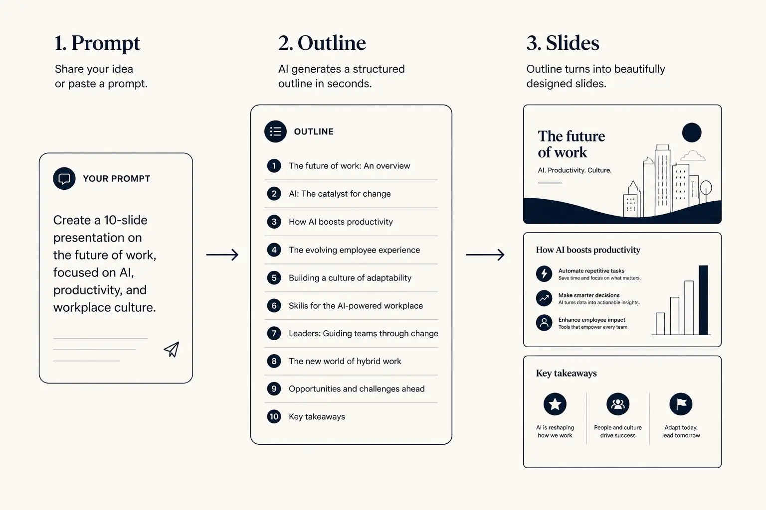
Prompt → outline → slides
1. Prompt
Audience, goal, length, proof you already have.
2. Outline
- • Opening claim
- • Proof beats
- • Ask / next step
3. Slides
The five axes
Each axis is scored 1–5. A “3” means usable for that job with known friction. A “5” means you would recommend the tool for that axis without caveats. Do not invent half-points; if you are between scores, pick the lower one until evidence is clear. Equal weight is the default.
1. Structure
Does the tool produce a story a real audience can follow, or a pile of decorated slides? Structure is the difference between “problem → proof → ask” and “random icons with captions.”
- 1, No narrative. Slides feel shuffled. Sections repeat or skip the decision the meeting needs.
- 2, Generic template sections with little connection to the brief. You must rebuild the argument.
- 3, Reasonable section order for the job; weak transitions; proof and ask are present but thin.
- 4, Clear arc matched to the brief. You can present with light edits. Hierarchy of claims is obvious.
- 5, Investor-, buyer-, or exec-recognizable structure out of the box. Outline is editable and stays coherent after changes.
Test prompt tip: ask for a 10-slide seed pitch with a specific ask, then move the traction slide earlier. Tools that treat structure as fixed layouts score poorly.
Fundraising narrative arc
Tension early. Proof before the ask. Titles should skim as a story.

2. Design quality
Design is not “more gradients.” It is hierarchy, density, and whether a slide is readable from the back of a room or on a shared Zoom window. Score design after you have fixed the content. Pretty nonsense still fails Structure.
- 1, Cluttered, low contrast, or template kitsch. Text overflows. Charts are decorative.
- 2, Clean-ish defaults but inconsistent spacing and typography. Looks AI-generated in a bad way.
- 3, Acceptable for internal meetings. Fine for drafts; you would restyle for board or customer-facing moments.
- 4, Strong hierarchy, restrained palette, data slides that scan. Minimal cleanup needed.
- 5, Looks designed for the job. Layout choices support the claim; no random ornament.
Slide density spectrum
Sparse
Live stage
1 claim, huge type
Balanced
Default
Claim + 3 proofs
Dense
Leave-behind
Detail for async read
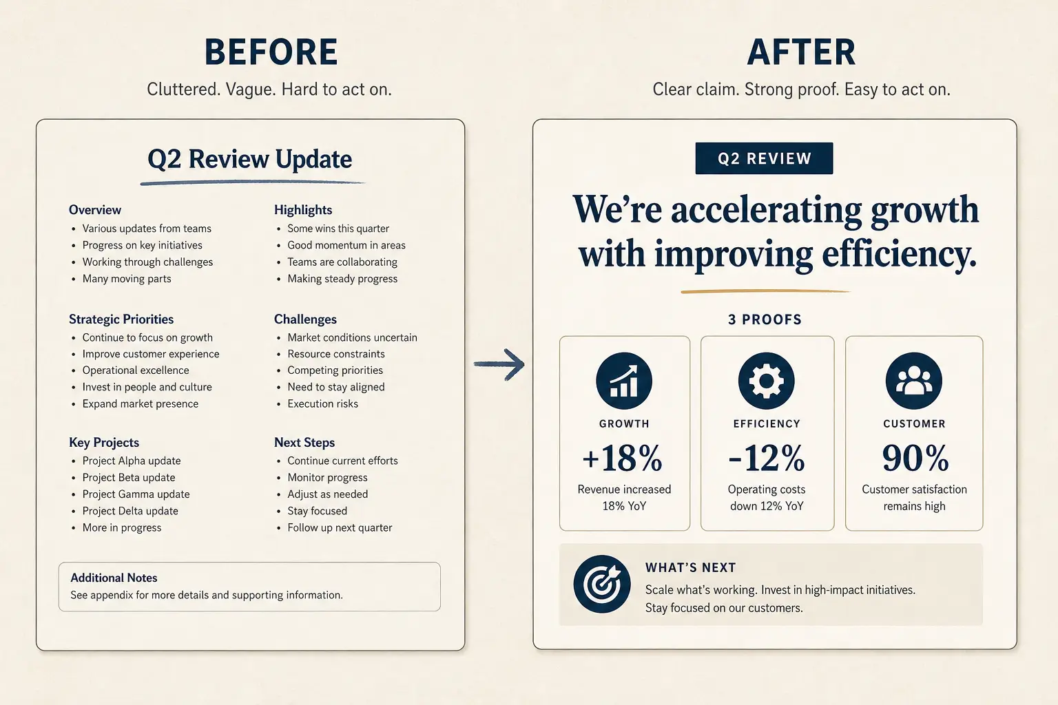
Anatomy of a claim slide
Claim headline (one idea)
Supporting line that states the so-what for this audience.
Source / footnote
3. Editability
Generation is a first draft. The product question is whether you can change the deck without fighting the tool, or regenerating from scratch and losing your edits. Collaboration-friendly editing with predictable results is a five; locked layouts that wipe local work are a one.
- 1, Locked layouts or regenerates wipe local edits. Practical editing requires export.
- 2, You can tweak text, but layout and section changes are painful or brittle.
- 3, Solid text and basic layout edits; deeper restructuring is awkward but possible.
- 4, Outline and slide edits stay in sync. Adding, splitting, and rewriting slides is routine.
- 5, Collaboration-friendly editing with predictable results. You would prepare a live meeting in the tool without a safety export.
4. Export fidelity
Some rooms want a present link. Some demand PPTX in email. Score the artifact the job requires, and be explicit when a tool is excellent for presenting but mediocre for files. Do not punish a present-first tool for average PPTX unless the buyer needs PPTX.
- 1, Export missing, broken, or so lossy you rebuild in PowerPoint.
- 2, File exists but layouts shift, fonts substitute badly, or images drop.
- 3, Good enough for archival or light reuse; expect cleanup for customer or board packets.
- 4, Reliable PDF/PPTX for most decks; minor fixes only.
- 5, Export matches what you presented. Safe as the system of record for that artifact type.
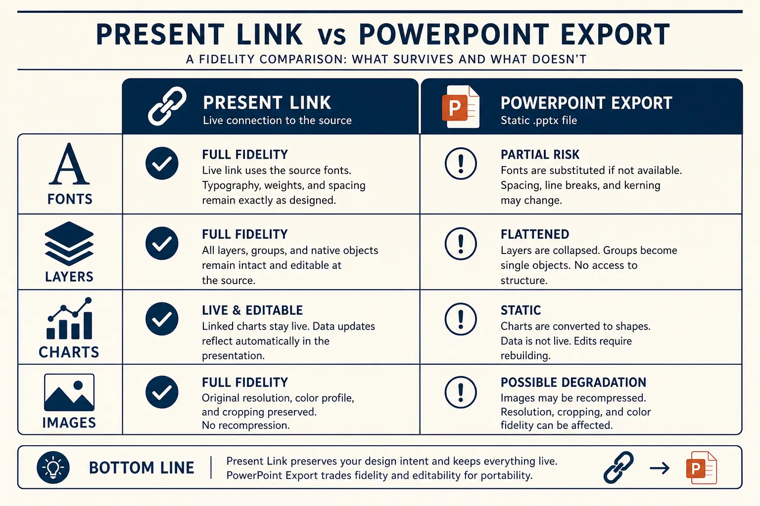
Present link vs PPTX fidelity
Present link
- • Live latest edits
- • Best for your room
- • Analytics-friendly
Export PPTX / PDF
- • Offline / procurement
- • Brand review in PPT
- • Expect cleanup passes
5. Honesty / transparency
This axis scores the product and its marketing together. Hidden limits, undated pricing claims, and “AI magic” that fails silently all count. Publishing method, tradeoffs, and corrections is a five; misleading claims and buried limits are a one.
- 1, Misleading claims; critical limits buried; competitor digs without evidence.
- 2, Partial disclosure; pricing or export caveats hard to find; demo ≠ product.
- 3, Main limits are findable; still leans on vague superlatives.
- 4, Clear about who it is for / not for; dated claims; failure modes acknowledged.
- 5, Publishes method, tradeoffs, and corrections. Links out to competitors when relevant.
Research that informs Design and Structure
Our Design and Structure axes borrow from established usability research on attention and working memory. Nielsen Norman Group’s guidance on minimizing cognitive load , avoid visual clutter, reuse familiar mental models, and offload memory work, is why we penalize dense icon soup and reward clear hierarchy after a forced edit. Their research on the F-shaped scanning pattern also explains why title-only reads matter: if skimmed titles do not tell the story, Structure is still mid-pack even when the thumbnail looks polished.
For fundraising jobs, we also expect founders to separate narrative slides from diligence depth. Investor.gov’s investing basics are a reminder that capital-raising claims need plain-language clarity — the same honesty standard we apply when a tool invents traction metrics or hides export limits behind demo theater.
Interactive: score a tool yourself
Use the scorer below while you test. Move each axis only when you have evidence from the forced edit and the export/present path, not from the homepage hero. Then open the matching compare page and see whether our published tradeoff sentence matches what you saw.
Score a tool on Gamma’s rubric
1 = fails the job · 5 = excellent. Compare fairly, then read the method page for definitions.
Average: 3.0 / 5
Read scoring definitionsWorked scorecard A: seed-pitch job
Brief: 10-slide seed pitch for a B2B workflow tool; must include problem, wedge, early traction (three real metrics with dates), and a $2.5M ask. After the first draft, move traction before product and rewrite the ask with use of funds. Artifact: present link for the partner meeting; PPTX leave-behind optional.
Tool A produces beautiful slides that ignore your metrics and regenerate when you reorder sections. Export to PPTX looks fine in a thumbnail but shifts two charts. Marketing claims “investor-ready in one click” with no dated limits. Tool B produces a plain but coherent outline, accepts the reorder, keeps your three metrics, and exports a PPTX with minor spacing issues. Marketing lists who it is not for.
- Tool A, Structure 2, Design 5, Editability 2, Export 3, Honesty 2 → average 2.8. Strong thumbnail, weak fundraising job. Recommendation: skip for seed pitches that still need narrative work.
- Tool B, Structure 4, Design 3, Editability 4, Export 3, Honesty 4 → average 3.6. Better pick for this brief despite quieter visuals. Recommendation: prefer for outline-first fundraising drafts.
Write the decision as a job sentence: “For seed pitches that still need narrative work, prefer Tool B; for brand-locked enterprise templates, revisit Tool A.” That sentence is what buyers remember.
Worked scorecard B: buyer sales deck
Brief: 12-slide deck for a mid-market SaaS AE after discovery. Must include the buyer’s stated pain in their language, one ROI model with editable assumptions, security objection handling, and a mutual plan with a date. Forced edit: swap industry proof and tighten the next-step slide. Artifact: leave-behind PDF plus live present link for the demo.
- Tool C (in-PowerPoint AI), Structure 3, Design 3, Editability 4, Export 5, Honesty 3 → average 3.6. Wins when the deck already lives in PPT and the AE only needs local rewrites. Loses when the narrative is still wrong.
- Tool D (outline-first workspace), Structure 5, Design 4, Editability 4, Export 3, Honesty 4 → average 4.0. Wins when discovery notes must become a buyer-specific story before anyone opens PowerPoint.
Tie-break on failure mode: if the AE’s pain is “I rebuild the story from scratch every time,” weight Structure and Editability. If the pain is “procurement requires PPTX tonight,” weight Export and say so. Silent averages hide that choice.
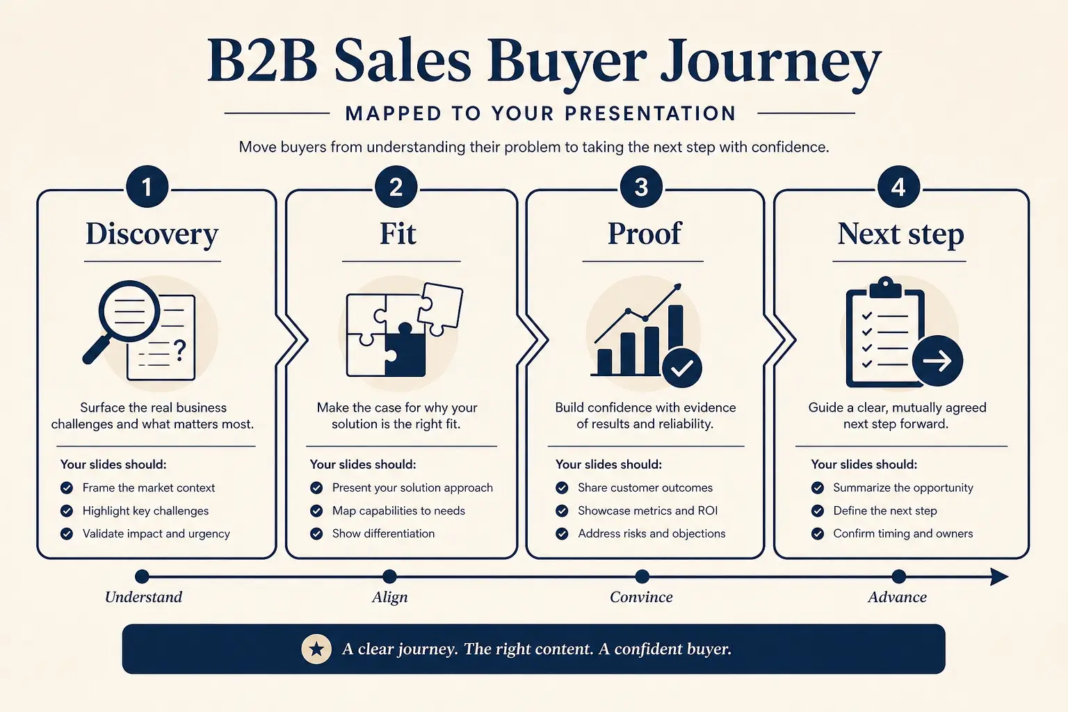
Buyer journey → slide map
Discovery
Pain + stakes
Fit
Why you win
Proof
ROI / risk
Next step
Clear ask
Worked scorecard C: QBR / exec review
Brief: 15-slide quarterly review for a product org. Must include a shared scorecard spine, wins/misses with causes, a decision ask, and owners. Forced edit: move the decision slide to position two and cut four status slides into an appendix index. Artifact: present link in the room; PDF for pre-read.
- Tool E, Structure 2, Design 4, Editability 2, Export 4, Honesty 3 → average 3.0. Looks executive in screenshots; collapses when you try to lead with the decision.
- Tool F, Structure 4, Design 3, Editability 5, Export 3, Honesty 4 → average 3.8. Quieter visuals, but the outline absorbs the reorder and the recommendation sentence stays owned by the PM.
Internal decks fail when AI invents causality. Deduct Honesty when the tool fabricates root causes or hides uncertainty behind confident phrasing. Deduct Structure when every team pastes a different template and the scorecard spine disappears.
Turning scores into a recommendation
Average the five axes for a headline number, then write the decision in plain language. Example patterns we use on compare pages:
- “Choose Tool A if you need rigid brand kits; choose Gamma if you need outline-first drafts you can edit before the meeting.”
- “Tool B wins export fidelity for heavy PowerPoint shops; Gamma wins when the present link is the deliverable.”
- “Neither tool replaces a designer for a keynote, both are draft accelerators.”
Never invent competitor pricing. If you cite a plan tier, date the claim and link to the source. Prefer job-based winners over “overall best.” When two tools tie on average, break the tie with the axis that matches the buyer’s failure mode.
Which tool for which job
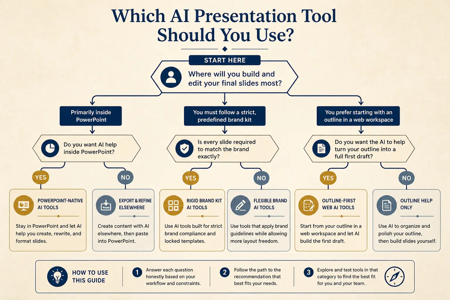
Need native PowerPoint editing every day?
Yes → Plus AI / Copilot · No → continue
Need rigid brand kits across a large team?
Yes → Beautiful.ai / enterprise kits · No → continue
Need outline-first AI drafting + present link?
Yes → Gamma
Jobs we always re-test
- Seed / Series A pitch (10–12 slides, clear ask)
- Buyer-specific sales deck with ROI and next step
- Product review / QBR with metrics and decisions
- Notes or doc → structured deck
- Export path: present link vs PDF vs PPTX
Annotated outputs from those jobs live on /examples. Product philosophy lives on /about. Category craft lives under /learn.
Evidence standards
Screenshots alone are insufficient. For each tool in a compare, keep: the prompt/brief used, the date tested, whether you used a free or paid tier, and one note on what broke during the forced edit. If marketing pages claim features you could not find in product, that deducts from Honesty, even if the other axes look strong.
Outbound links to competitor sites belong in the article. Readers should be able to verify. Corrections get a dated note at the top of the compare when a score changes by a full point or more. Undated “best AI” lists without a method fail this page by definition.
Failure modes in evaluation itself
- Scoring the demo prompt instead of a real brief with proprietary facts
- Skipping the forced edit because the first draft “looked fine”
- Averaging pitch and classroom jobs into one forever-winner
- Letting Design outvote Editability because thumbnails convert
- Hiding export caveats in a footnote after a perfect Design score
If your evaluation process has those failure modes, fix the process before you publish scores. Bad methodology is how the category earned its skepticism.
What this rubric is not
It is not a lab benchmark with synthetic pixels. It is an editorial protocol for buyers who have one afternoon to pick a tool. It will not capture every enterprise procurement checkbox. It will catch the failures that waste presentation time: weak structure, uneditable output, and exports that lie.
It also does not crown a permanent winner. Models, templates, and export pipelines change. When Gamma improves, or slips, on an axis, the public score should move. That is the point of publishing the method.
Frequently asked questions
From scores to action
Use the interactive scorer only after you have evidence from the forced edit and the export or present path. Moving sliders based on homepage heroes recreates the affiliate theater this rubric exists to prevent. When your average lands near another tool, break the tie with the axis that matches your failure mode, usually Editability or Export fidelity, and write that tie-break into the recommendation sentence so procurement does not optimize for a trophy.
Keep a one-page scorecard in your wiki with date tested, brief used, free or paid tier, what broke during the forced edit, and the job-specific winner sentence. Re-run after major launches. If a score moves a full point, add a correction note rather than silently rewriting history. That discipline is how editorial evaluation stays useful after the blog post is published.
Original framework for turning scores into action: Job, Forced Edit, Artifact, Sentence. Name one job. Force one narrative edit. Score the artifact the room requires. Write one who-should-pick-whom sentence. Anything shorter is a vibe check. Anything longer without that sentence is a spreadsheet without a decision. Procurement packets should include the sentence above the average.
Concrete next step: pick tomorrow's real brief, run Gamma and one alternative through the same five-step test, fill the interactive scorer with evidence-backed numbers, and file the scorecard with dates. If Gamma loses on your binding constraint, choose the other tool for that job class and keep Gamma where outline-first drafting still wins. Dual-running by job class beats forcing a single forever winner.
See the rubric applied in product
Generate an outline-first deck, force an edit, then present, the same loop we score.